We don't just implement Odoo. We design it to sell. And one of the most underrated levers of web design in Odoo is Odoo website animations: not as a visual whim, but as part of the page architecture.
Most partners implement the Odoo website and leave it static. Functional, correct, but bland. And therein lies the design problem: a static site doesn't convey quality, and a site that doesn't convey quality doesn't generate enough trust for someone to fill out a form.
The interesting thing is that Odoo's Website Builder already includes much of the visual resources needed to solve this. Without opening the code editor. Without touching a single line of XML.
What Odoo itself already gives you
1. Entrance Animations(Animate) Each block in the editor has an "Animate" tab in the options panel. From there you can activate:
- Fade in / fade out
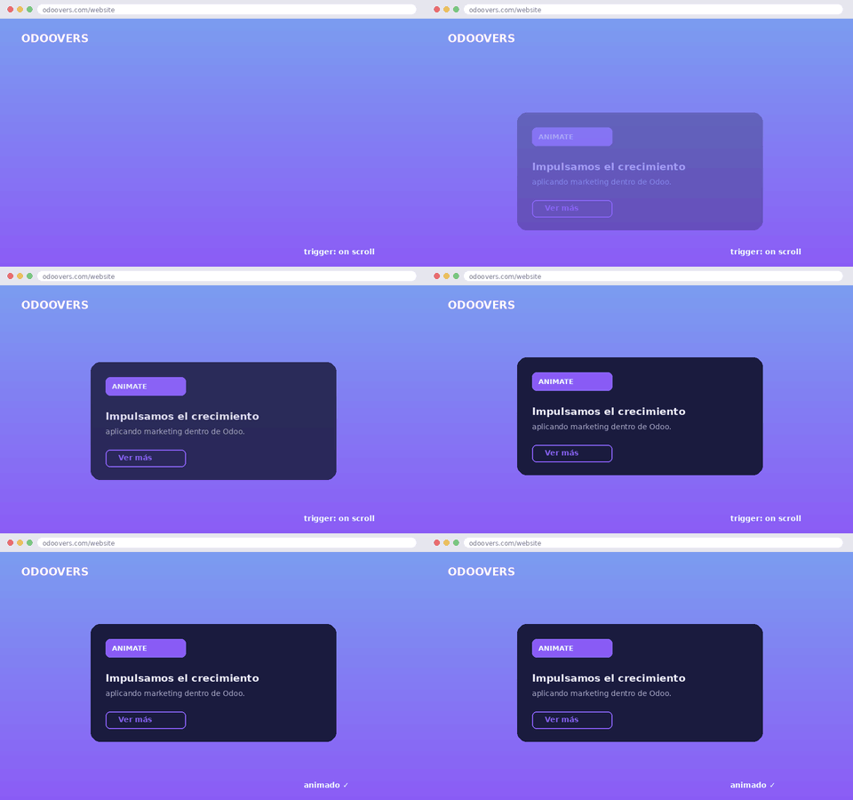
- Slide (from top, bottom, left, right)
- Zoom in / zoom out
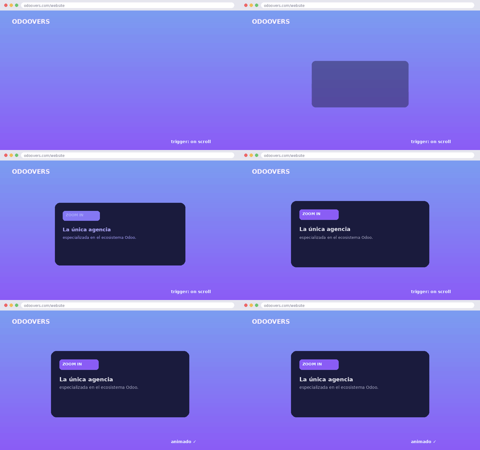
- Bounce
And most importantly for business: you can control the trigger. It's not just "animated on load," you can activate it on scroll, which means the user sees movement right when they reach the point where you want them to pay attention: the CTA, the price, the testimonial.
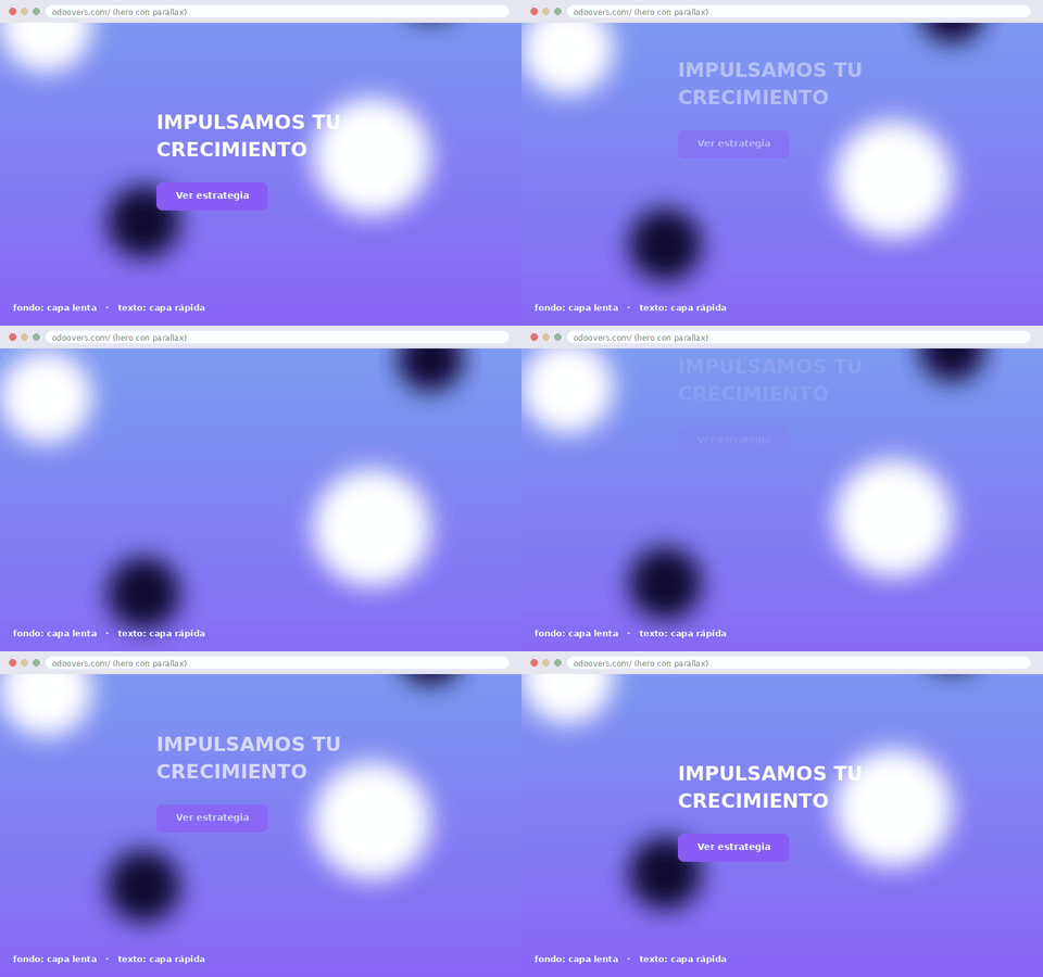
2. Native parallaxIn "Banner" or "Cover" blocks, there's a parallax effect option directly in the editor. This adds depth to hero sections without loading an external library. Use it wisely: poorly calibrated parallax on mobile is the leading cause of bounce rates on half of the sites we audit.
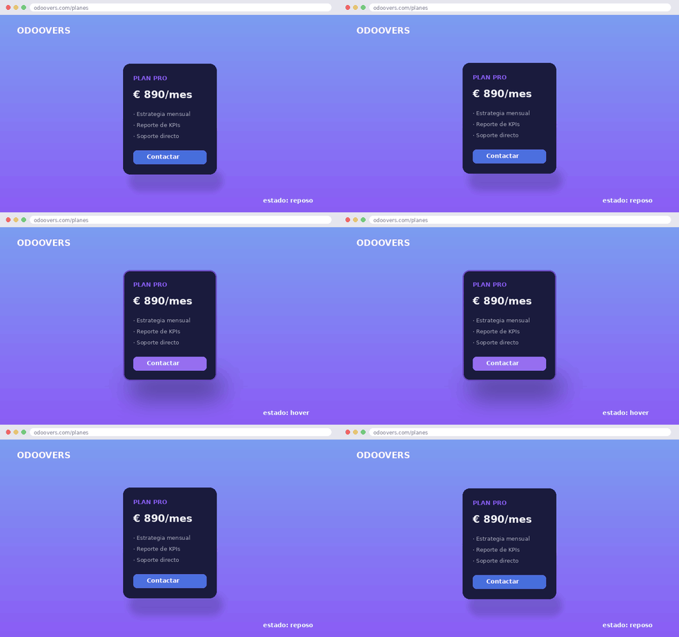
3. Hover states on buttons and cardsOdoo snippets (product cards, pricing, testimonials) already include configurable hover micro-interactions: shadow, elevation, color change, animated underline. This isn't just about aesthetics. A button that responds to hover reduces decision friction because it tells the user, "This is clickable, this reacts."
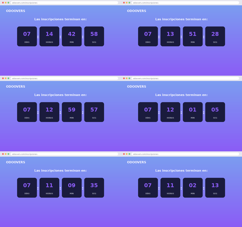
4. Countdown (Odoo Countdown block) The "Countdown" block animates a real-time countdown: days, hours, minutes, and seconds ticking down to a specific date. It's native, requires no coding, and its most effective use is the same as always in marketing: creating a sense of urgency. Sign-ups close, offers end, or a plan launch with limited spots. The user sees the time ticking by, and that drives their decision more effectively than any text that simply says "limited-time offer."
5. Interactive progress bars and timelinesUseful if you sell processes (implementation, onboarding, methodology). The user sees progress, not just reads about it. This reduces the cognitive load of decision-making, and less cognitive load means more conversions.
What almost nobody sets up correctly: the timing
This is the point that separates a site that "moves" from a site that converts. Odoo's default animation settings usually have generic delays and durations. If you don't adjust them:
- The animations compete with each other and the user loses focus.
- The scrolling feels "heavy" on mobile, which is where most of your traffic comes from if you're coming from LinkedIn or Google Ads.
- The main CTA loses visual hierarchy compared to decorative elements.
We don't measure "how pretty it looks." We measure time on page, scroll depth, and click-through rate to the form. An animation that doesn't affect those metrics is just noise.
Why this is also a business decision
Many partners know how to implement Odoo. Few know how to use Odoo itself to generate demand. Animations and micro-interactions aren't just a visual gimmick: they're the difference between a visitor who bounces and one who reaches the contact form with just the right amount of friction to convert.
Implementing the Website Builder correctly doesn't guarantee traffic. But configuring it incorrectly guarantees losing it.
And when the editor doesn't show up: what do we do?
Here's the part that's not usually explained: the Website Builder has a limit, and inweb designThat ceiling appears quickly. A hover effect with realistic physics, a scroll sequence with several synchronized elements, a micro-interaction linked to a specific form event: that no longer comes from the editor with clicks.
When this happens, we don't automatically say "yes, let's implement it." The first step is to consider whether it's feasible within the Odoo editor, and if not, we evaluate whether it's worthwhile to use a non-native tool. Because every animation you add outside the builder has a cost that isn't visible in the design: page weight, additional JavaScript, loading time.
And that's where we don't compromise: we won't add a pretty animation if it's going to negatively impact our SEO. If something can't be done without code, we'll only consider custom development if it's feasible within the editor's structure and doesn't harm performance, because a website that loads slowly loses rankings, and a website that loses rankings doesn't generate the traffic we then convert into real opportunities.
That's the criterion: design that moves, yes, but without paying for it in speed or SEO.
Is Web design not about aesthetics; it's the first layer of conversion.
Many partners treat the Odoo website as a technical data sheet. We treat it as the first point of sales contact. The design, including animations, is what determines whether a visitor stays for three seconds or submits a form.
We design lead generation systems within Odoo that convert traffic into real opportunities, taking care of every visual detail without sacrificing speed or positioning.